Company | independent design for portfolio
Timeframe | one week
Deliverable | type specimen landing page
_
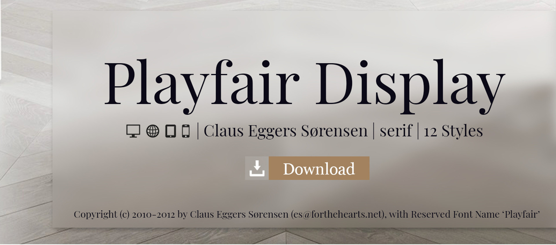
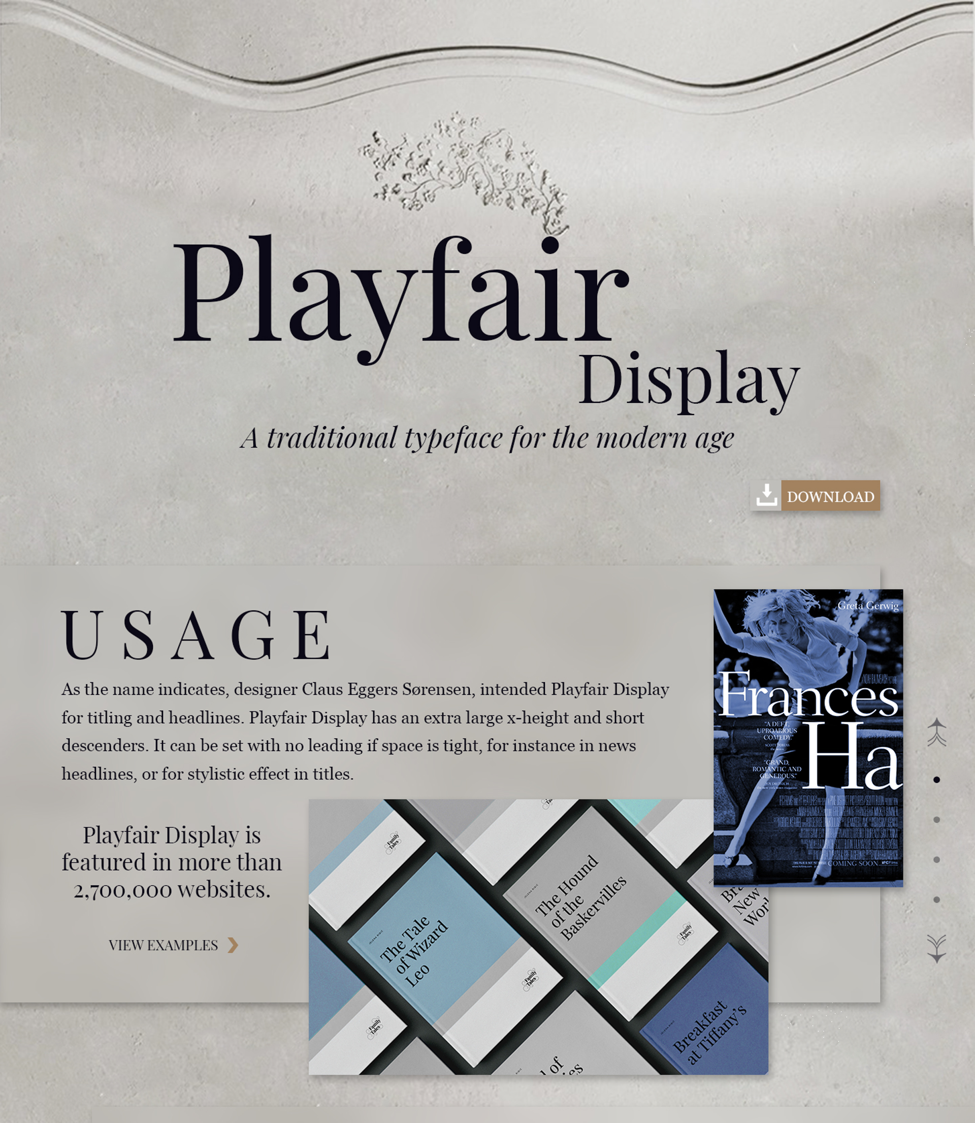
The goal of this project was to create a purposefully designed typographic specimen for Playfair Display and showcase it as a desktop landing page with CTR.

First off what is a typographic specimen?
A type specimen is a publication in which a typeface is shown and presented, detailing what fonts the typeface consists of. These specimen can be used by graphic designers and typographers to judge how a particular typeface behaves on the printed page, and to decide if they want to buy and use the typeface in question.

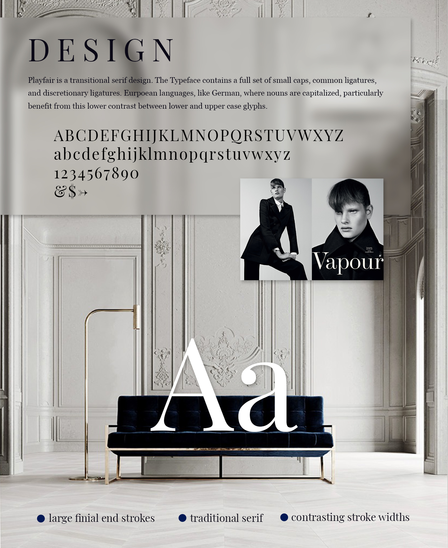
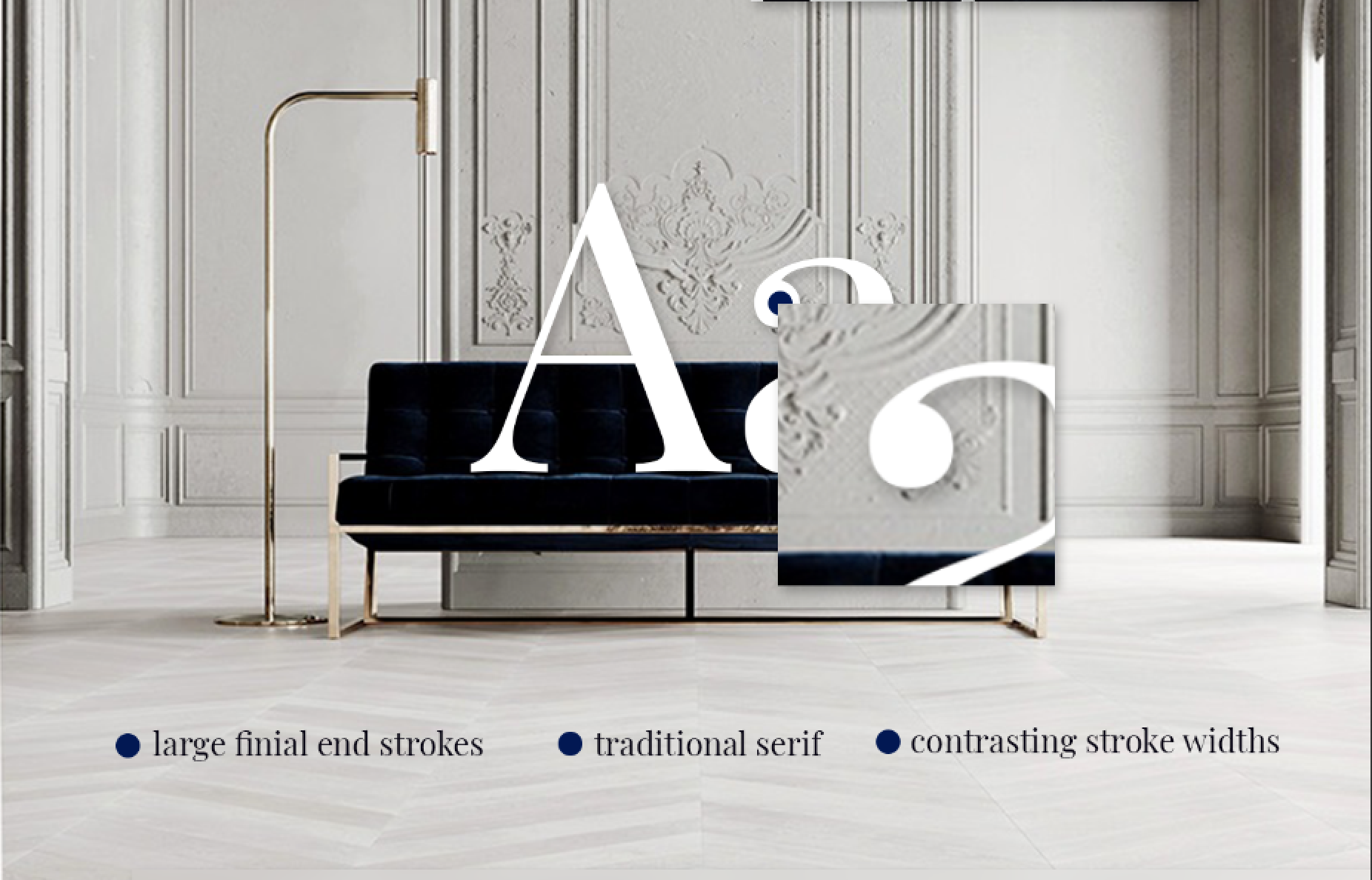
Playfair takes its design from the time of enlightenment in the late 18th century. Broad nib quills were replaced by pointed steel pens, which influenced typographical letterforms to become increasingly detached from the written ones. This shown by most ears and tails ending in a round ball shape, G’s having a linked loop, and most letters contain contrasting line widths.
As the name indicates, Playfair Display is well suited for titling and headlines. It is still quite rare to find a classical typeface tuned for display sizes.

Before designing the landing page I had to consider why would someone want to use Playfair Display. Using the history of the typeface I concluded the reason a designer would purchase the typeface.
“To provide designers with an elegant yet modern typeface that offers a feeling of sophistication to their content”
Combining classical and modern elements was a difficult tasks. It took boiling down the two themes to uncover what moods are shared between them. Contemporary, rich, classic, trustworthy, and elegant were feelings that I felt both expressed the modern and classical elements of Playfair Display’s mood.

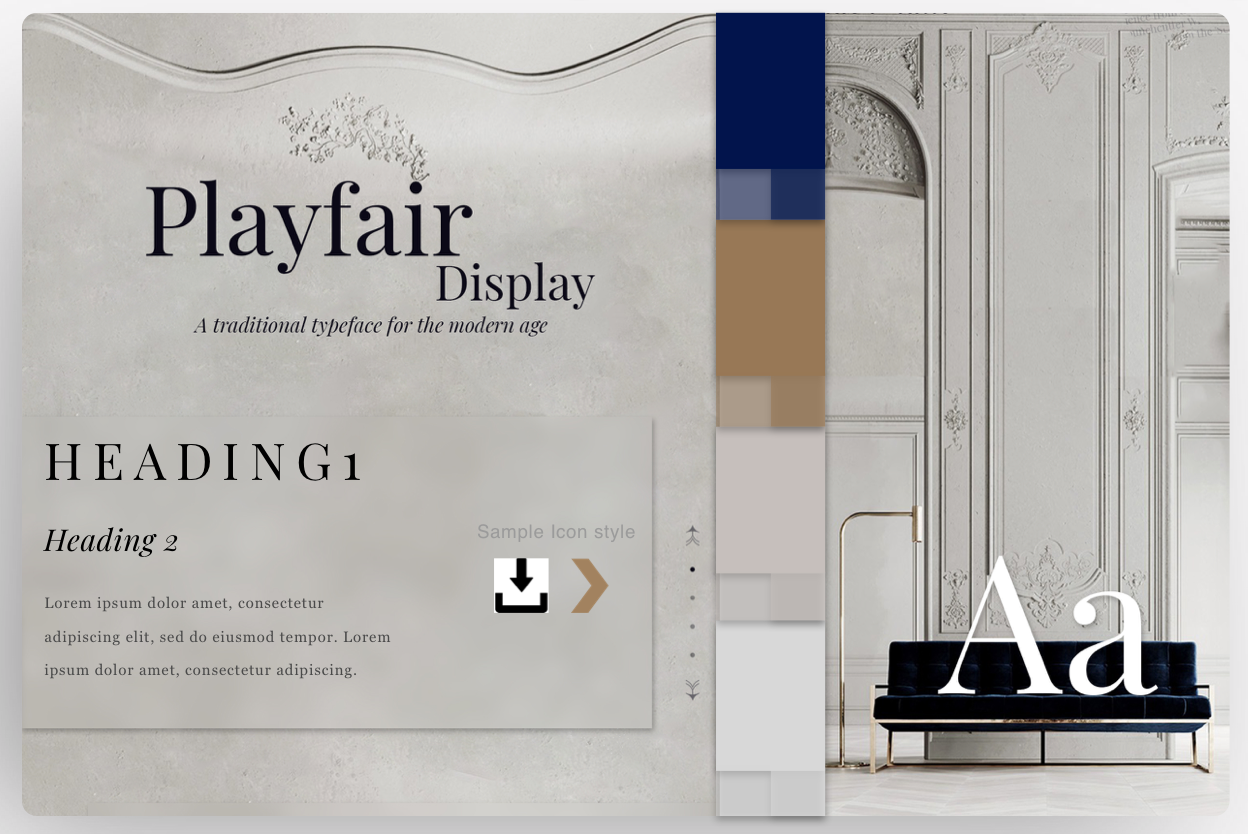
I created a style tile using notes from the mood board to better see all the elements of the landing page together. Headings, kerning, leading, fonts, icons, colours, and shadows are all shown in this style tile.
When creating the design of the landing page I had originally started moving towards a more flat design. I had flattened the images in Adobe Illustrator to give almost a painted or drawn feeling. Although this created continuity between the images it gave the landing page too much of a classic / interior design feeling and lacked the modern touch that I was working so hard to integrate.
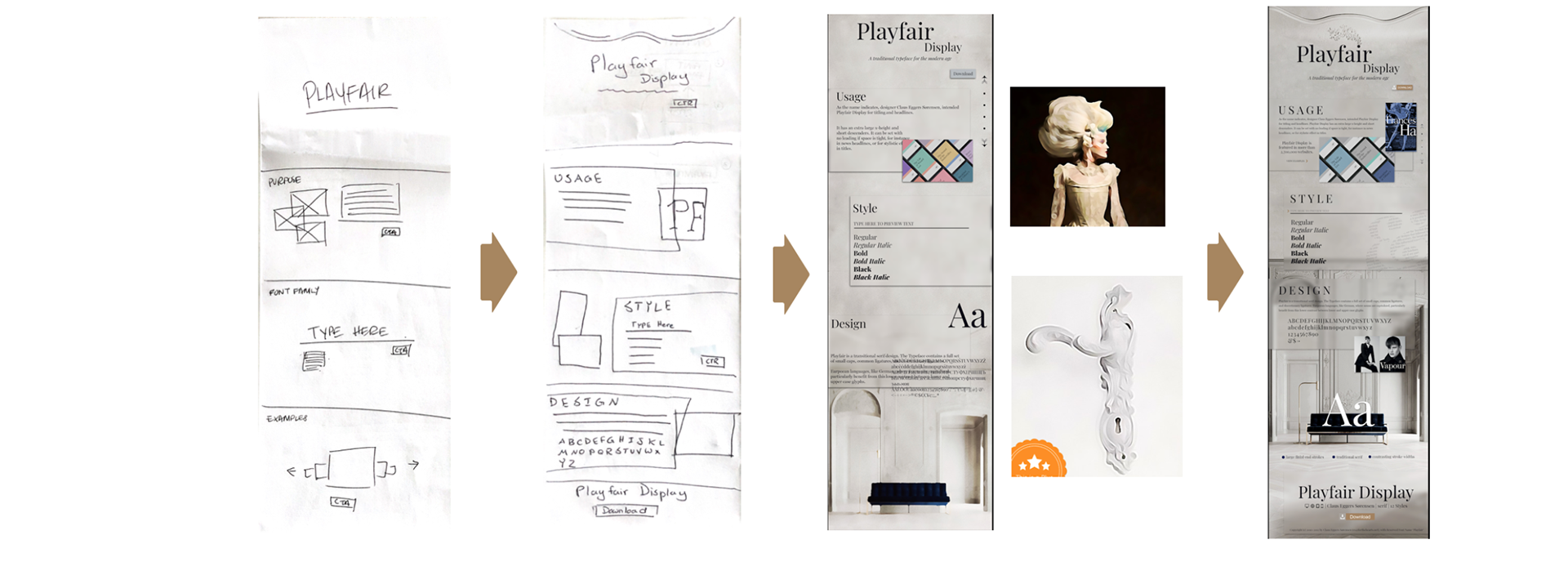
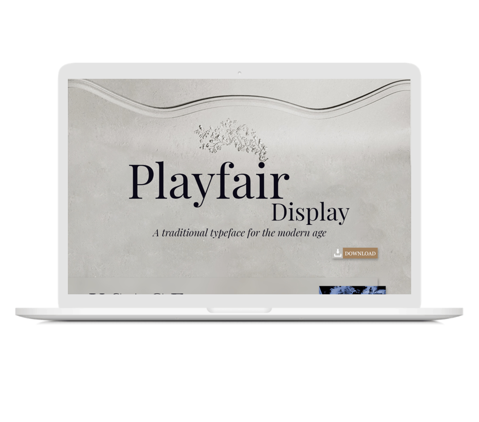
For the final design I recreated the inspiration picture as the background and used modern opaque panels to make a place for easy to read content to be displayed.

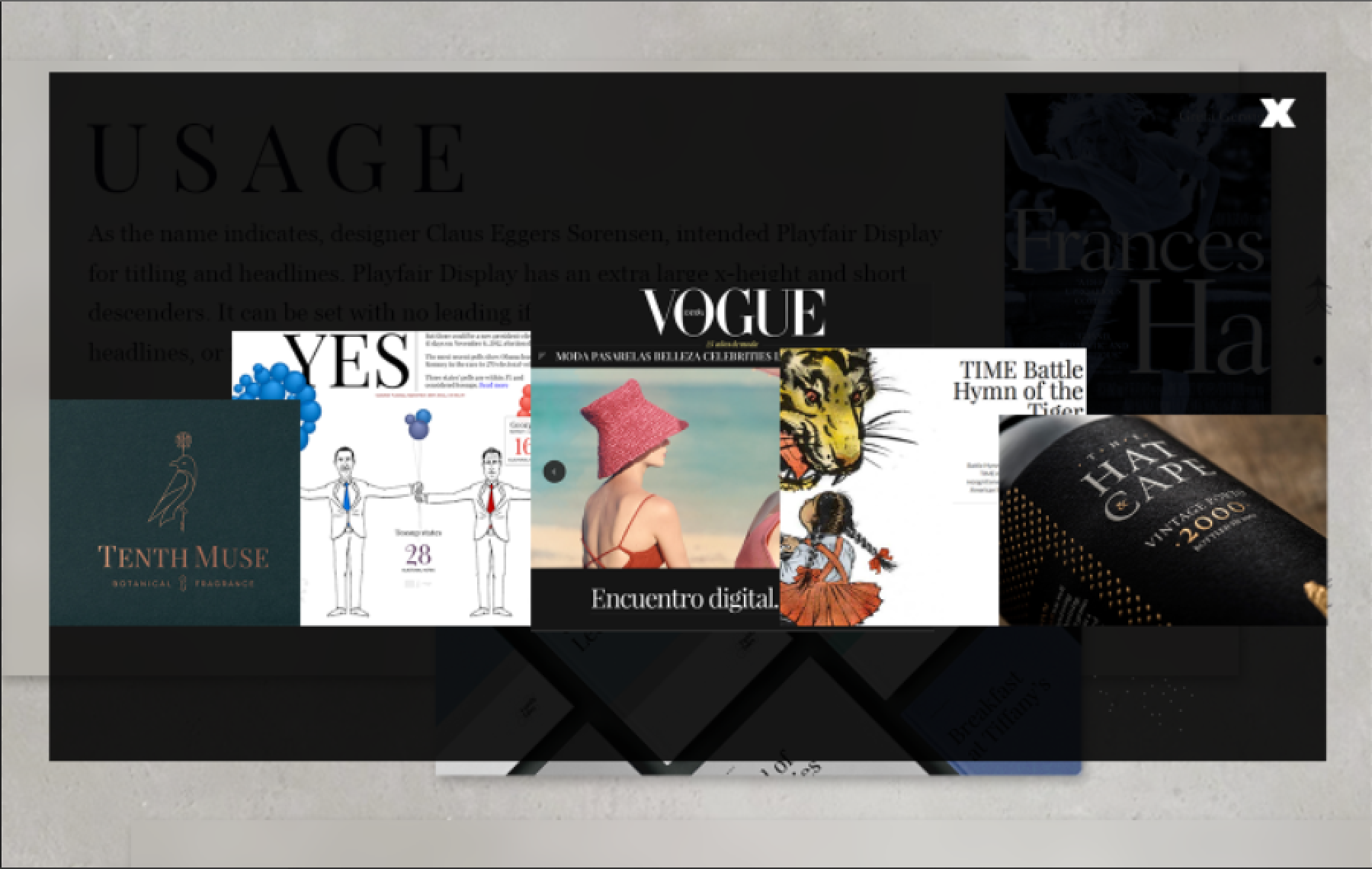
"View Examples" Popup

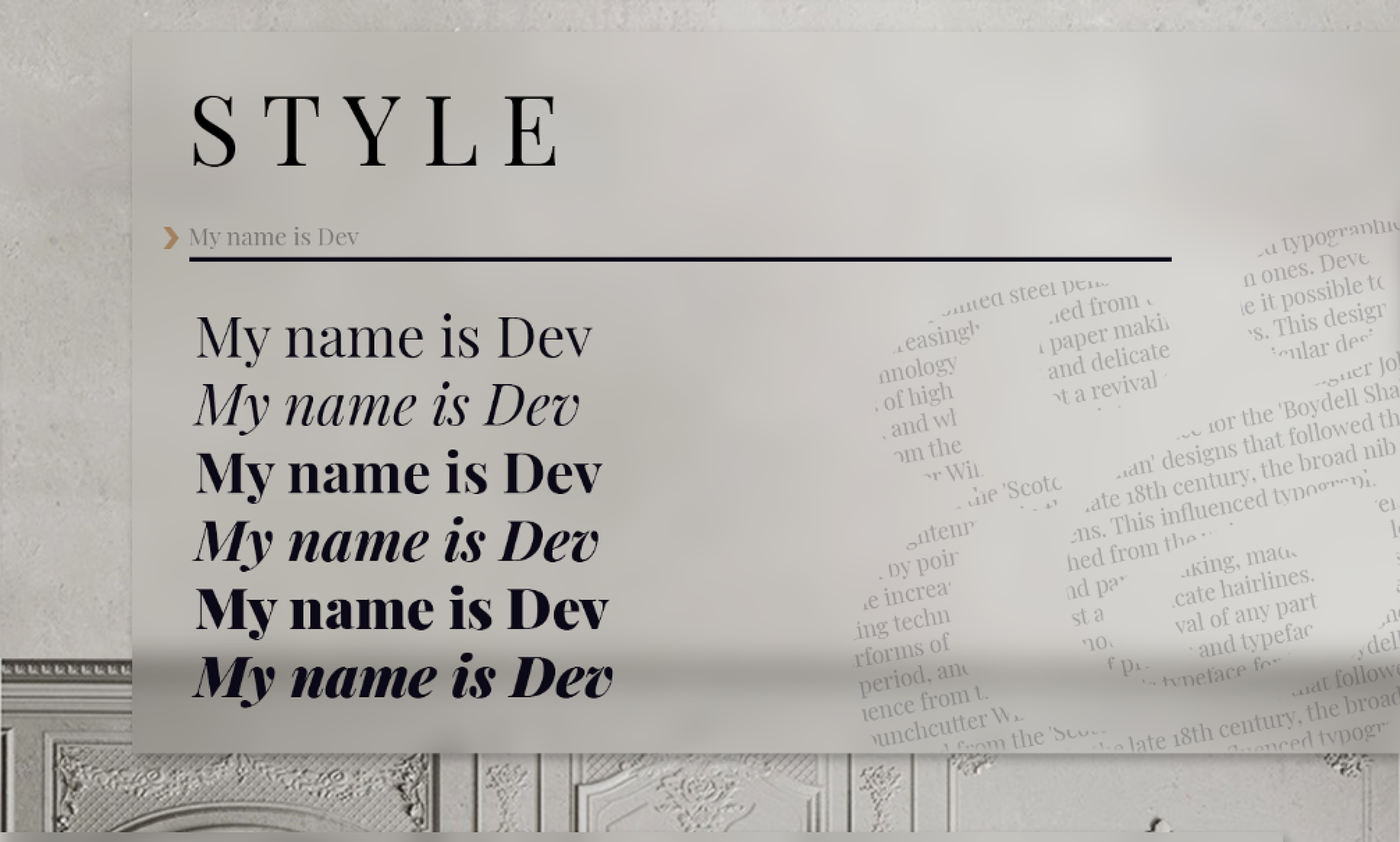
Style Preview Example
Font Detail Hover Example