Company | Purple Orca Creative Arts
Timeframe | three weeks
Deliverable | responsive web design for registration and to display student's work online
_
The goal of this project was to design a website that creates a place where individuals can discover how to develop their creative independence.
Client Goals
1. Grow the client base by increasing the awareness of the POCA studio.
2. Create a secondary class registration channel by offering registration online.
User Goals
1. View students work easily by viewing an online gallery.
2. Get a better understanding of the studio and teachers by having access to this information online
3. Register more easily by registering online.

We wanted the mood board to capture the feeling of the site and not just be a visual representation of what the site would look like.
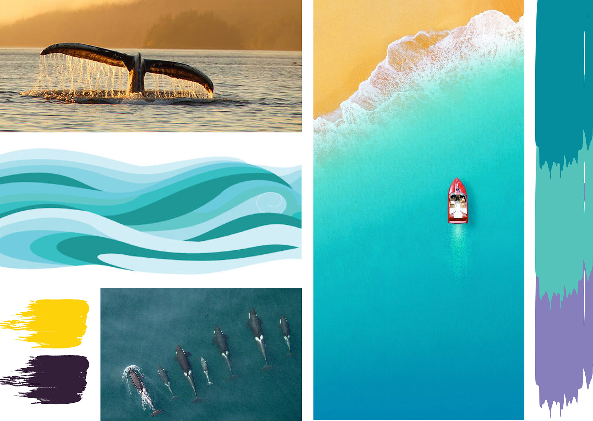
Pod of orcas — Symbolizes community and togetherness for the studio
Beach — Calm and symbolizes a large brush stroke
Yellow — will be the accent colour for buttons
Blue, turquoise, purple — are the main colours selected during the design inception
Flat wave — One of the main design features in the design symbolizing paint strokes
Whale tail — Purpose
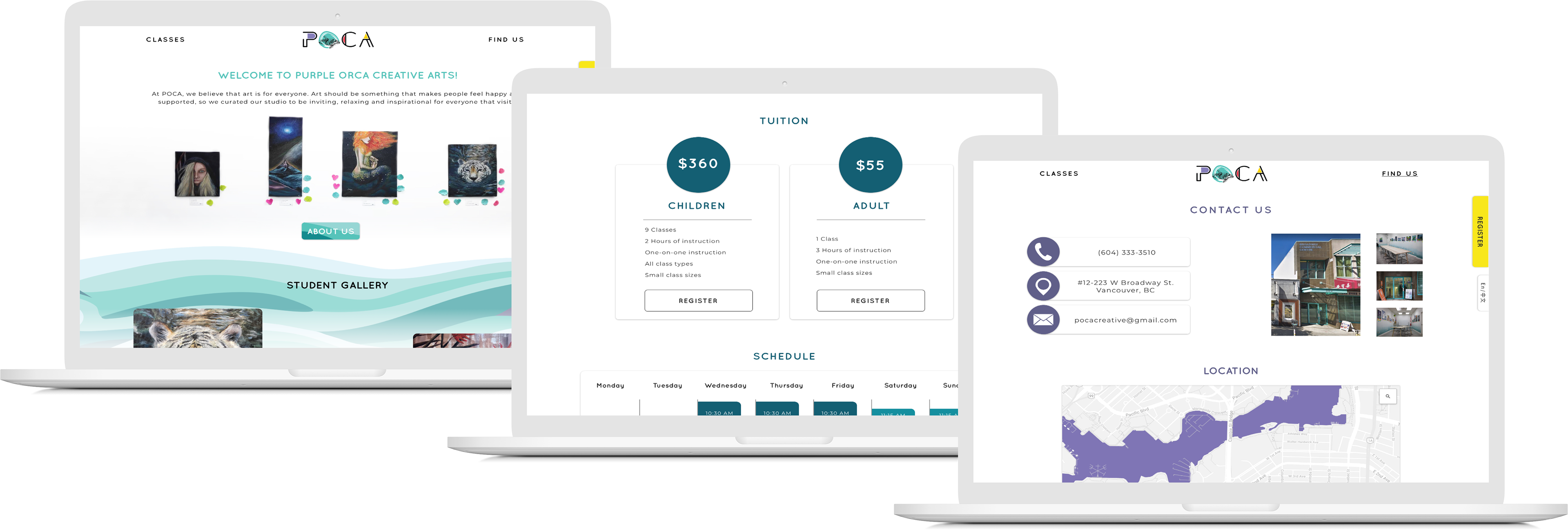
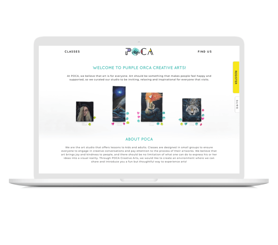
We decided to limit the amount of real photos in the design and use digital illustrations instead. The purpose of this is that we want the students art to be the main focus and for our content to elevate their work. The flat design compliments the students art and doesn't compete or cause the design to look busy. We added a slight drop shadow to create cards that broke up the white space on pages.
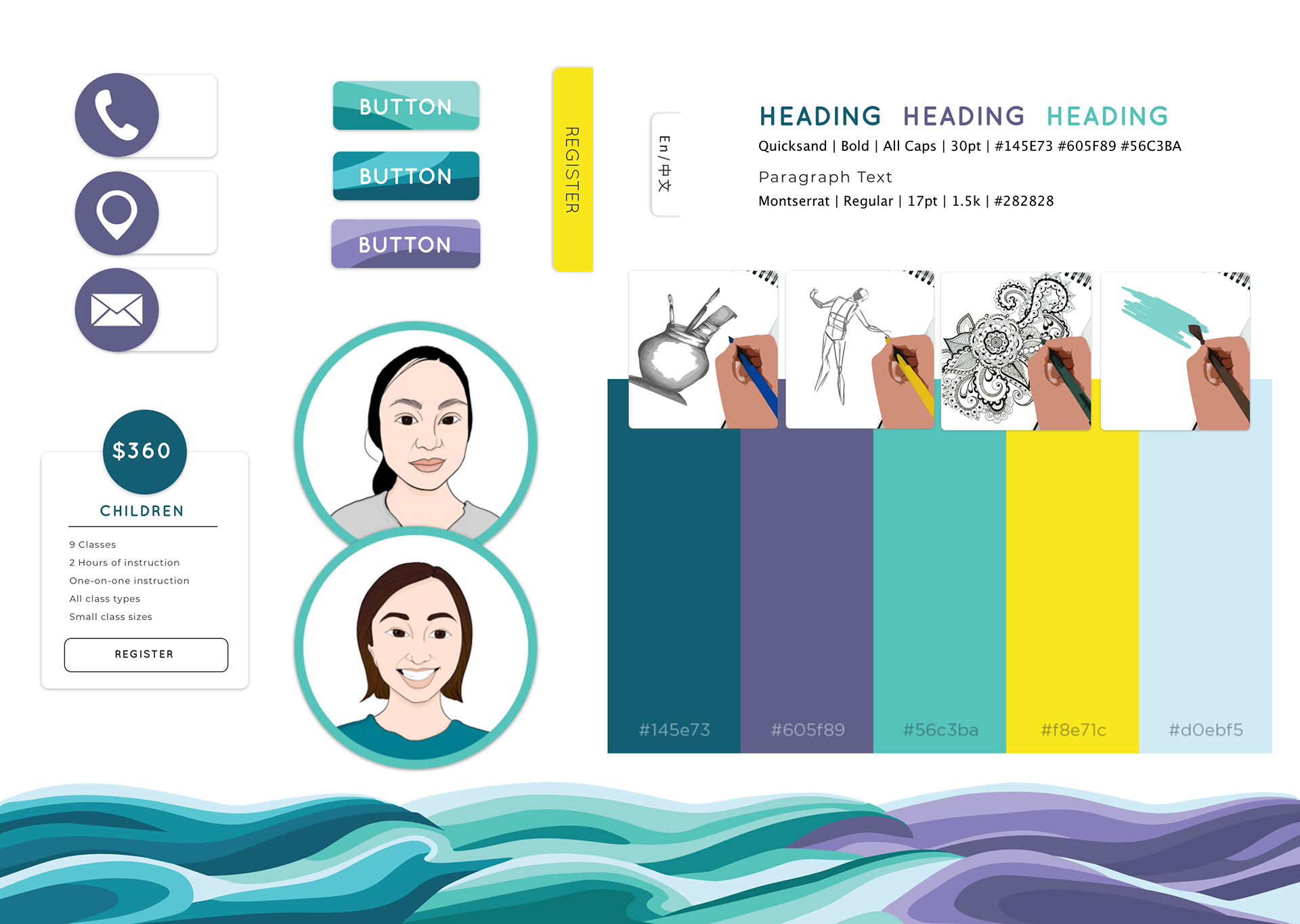

A key feature is the wave that we created. It separates the gallery from the rest of the site and acts as a barrier that slides to show more information when users expand the section they are on. the wave transitions from blue to turquoise to purple and creates the main colour pallet for each page it is on while still creating unison across all pages. When clicking through the main pages the wave slides horizontally as the pages changes to show a fluid water like motion.
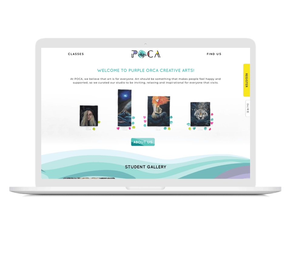
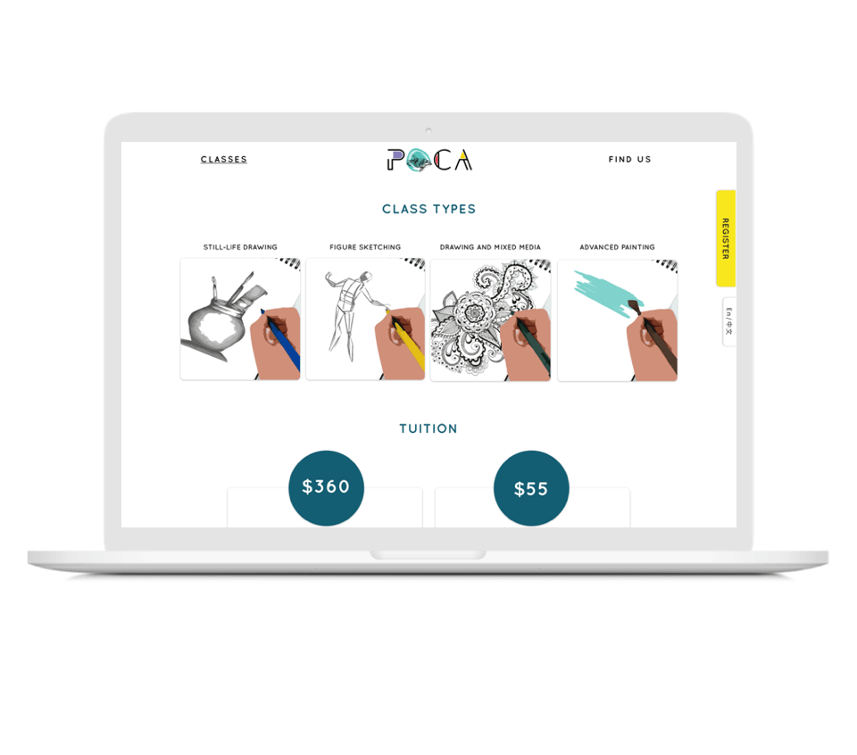
Progressive exposure was another key design feature we implemented. Progressive exposure means that specific information is given to the user only when they need it as not to overwhelm them. Each page uses progressive exposure. The key information is available on each of the landing pages with a button that displays additional information that the user can scroll down to read.
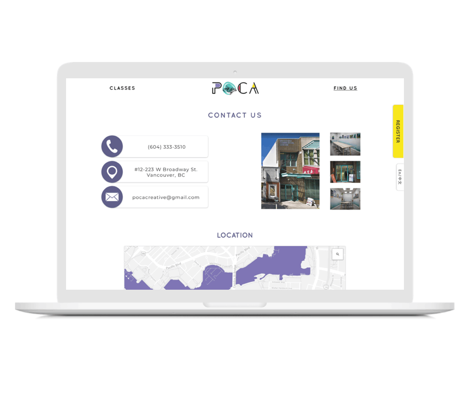
The gallery was one of the main features our client wanted on the website. We created away so that the gallery is always available on the bottom of every page. The gallery is populated by an instagram account which allows Edith to easily upload photos to the website so there is always new content.
The final key feature was the make the site bilingual. This was an important feature because many of the users are Chinese. We created a language toggle on the right side scroll that is always visible. This makes switching the site’s langue easy.