Company | independent design for portfolio
Timeframe | three weeks
Deliverable | responsive web design and marketing assets
_
The goal of this project was to create a responsive website and corresponding campaign for a music festival.
For this project, it was important to establish a consistent visual identity that carried through every element of design from the wristbands to the ticket purchase on the website.
The foundation of the design utilized some UX design but is mostly focused on the UI elements to showcase my more visual skills.

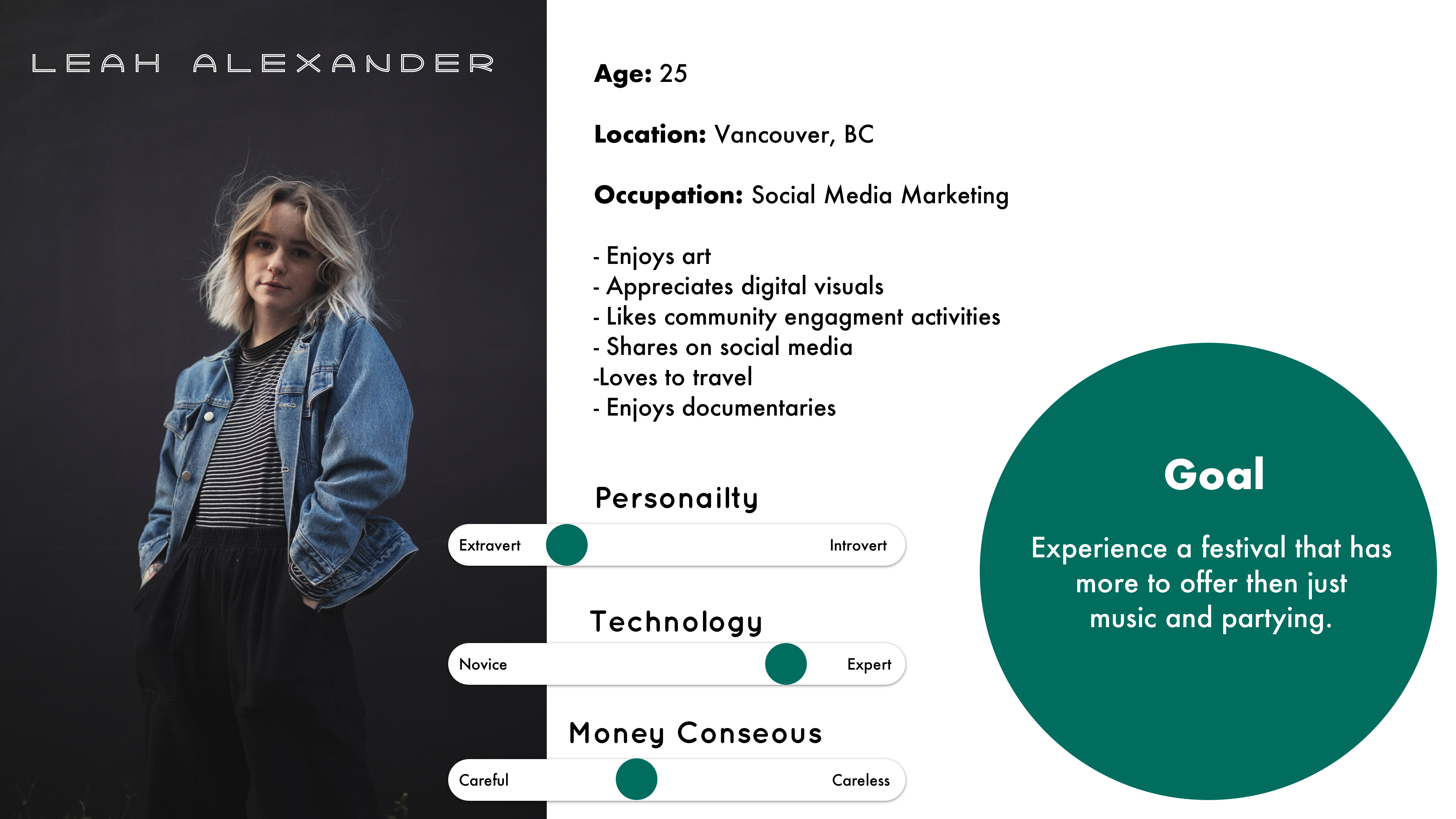
For this music festival, I created a target persona with a goal to find a music festival that has more to offer than just partying and art. I hoped that this would, later on, strengthen my competitive advantage over direct music festival competitors.
I wanted to create a strong visual brand identity for the responsive website that was an engaging, impactful and well-designed experience for the users but still optimized to meet business goals.

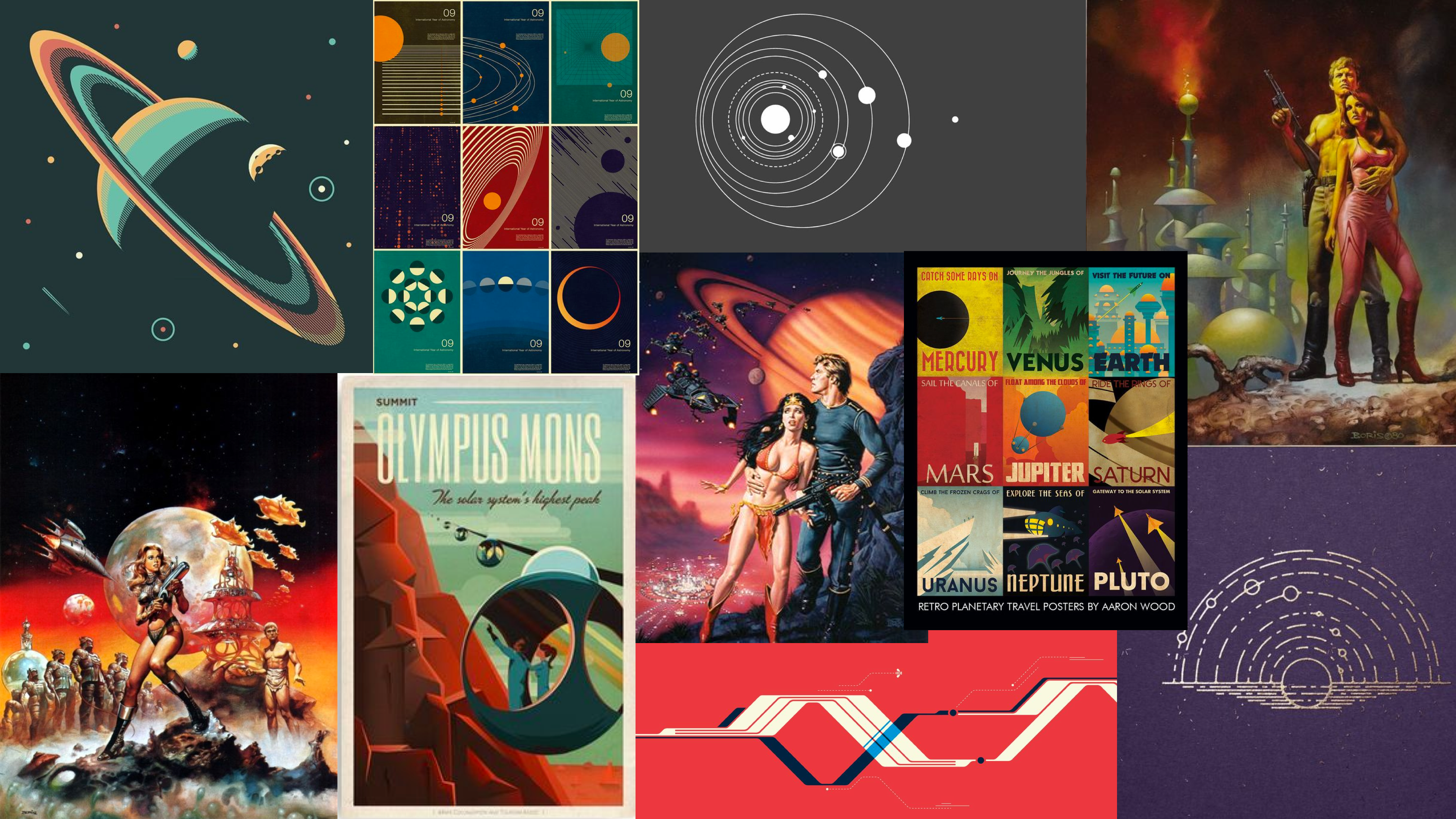
Combining the findings from all the research categories allowed me to create a design inception that is based on facts and not just aesthetics and personal preference. I also wanted to make sure that the design stood out against other music festival competitors. The purpose and aesthetic of the music festival should be at the core of the design I didn't want to create something that just looked like it had a theme.
Galactica Moodboard
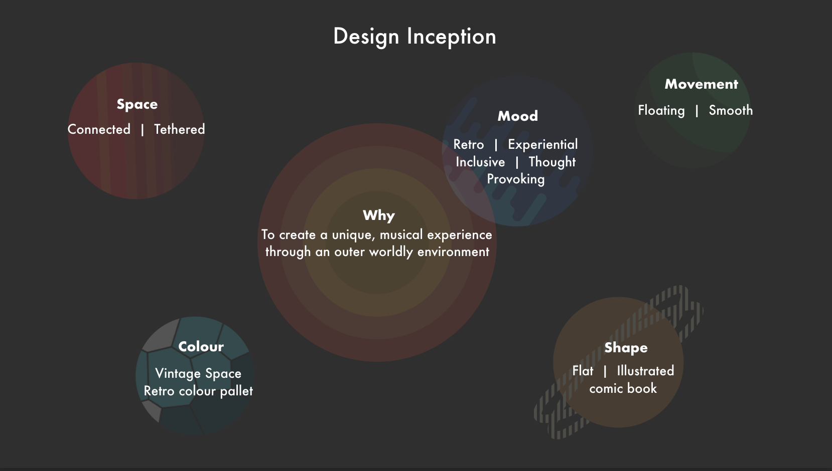
Space and all its wonder is the essential element of the Galactica experience. The unique festival site is thoughtfully curated and designed to transport attendees to the outer reaches of the known and unknown universe by combining aspects of nostalgia, myth, and fact — creating a communal experience of wonder and discovery.
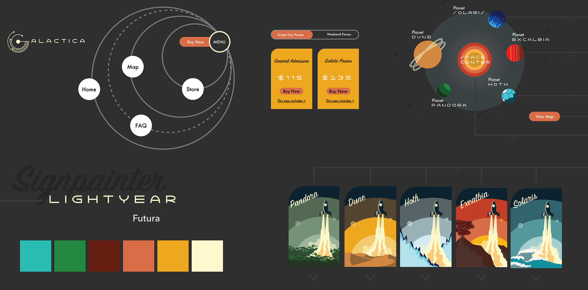
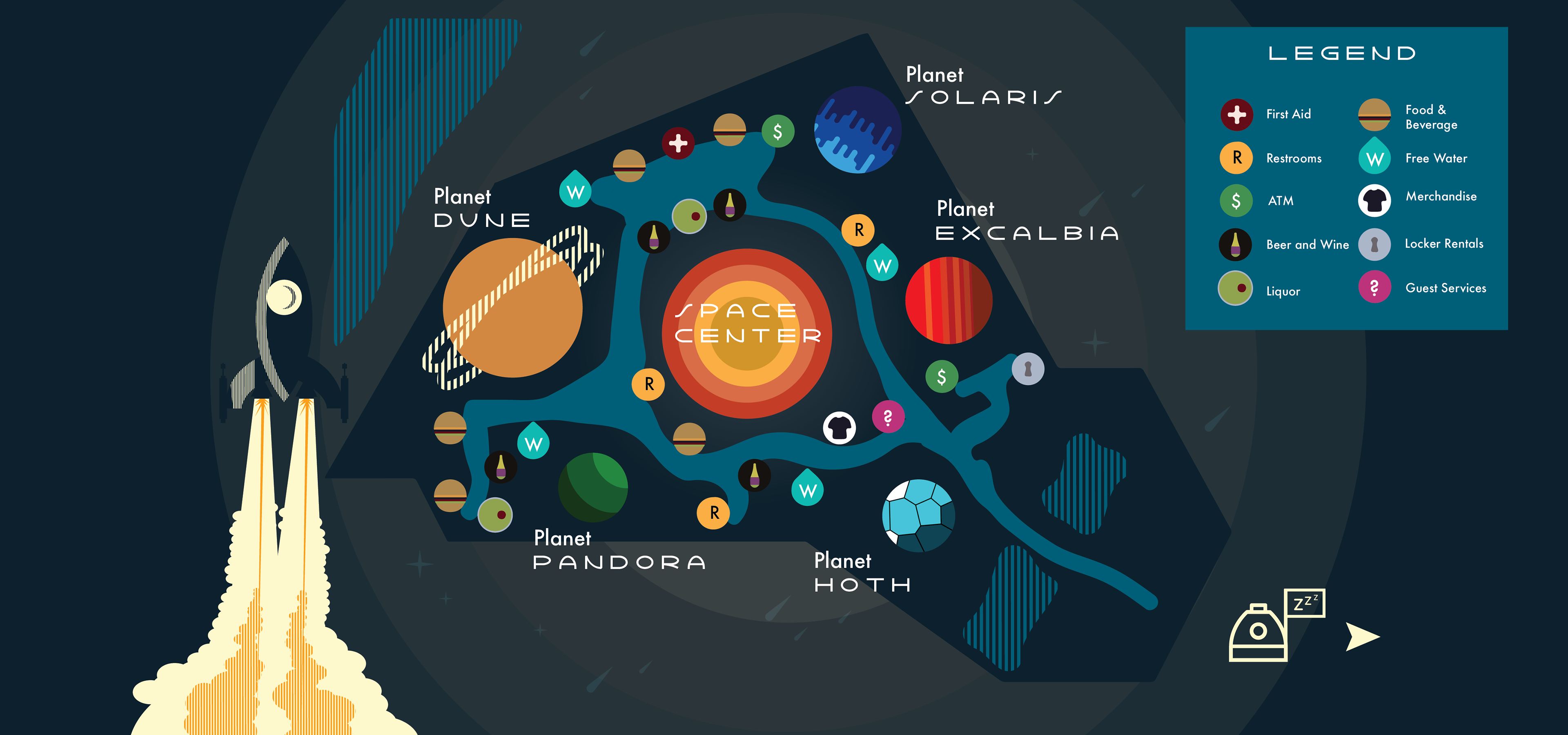
The core design of the festival is created as a galaxy. Each is stage designed as its own planet and offers a unique experience both visually and audibly. The four planets each have their own element associated with them; fire, water, sand, ice, and jungle. Corresponding relatable names have been given to each planet to create a sense of nostalgia and excitement about actually visiting those planets.
The website background contains vintage comic book cutouts in a darker grey that create depth and interest, but isn't distracting. Specifically, as you scroll down the home page I have created an epic space battle in the background that subtly draws the users vision down the page.

When studying vintage posters I realized how important texture is. For the texture of my site, I decided to just simply use tight vertical lines. This design aspect can be seen used everywhere from posters to maps.
I created art elements, using Illustrator, for each planet that I was able to pull aspects from to use as elements for the website giving the design a cohesive feeling.

My design task was creating a festival that set out to establish a different type of music festival where you could explore and learn alongside listening to your favourite bands. I wanted to design a venue that was purposeful and related to my overall theme. I feel I have created a design that transports users to the outer reaches of the known and unknown universe by combining aspects of nostalgia, myth, and fact — creating a communal experience of wonder and discovery.