Company | Critical Thinking Studio
Timeframe | one week
Deliverable | logo for native ios app
_
The Critical Thinking Studio is inspired by Vancouver’s elite and exclusive educational schools. CTS takes the teaching methods and content that has been exciting curious minds and opening closed ones in the classroom and turns it into an interactive, first of its kind online learning experience.
This Logo was designed to accompany an app that seeks to adapt the elite school experience to the online world where it can benefit anyone without the exorbitant cost.
I wanted to create a logo that was abstract in design, but still had a connection to the brand. I initially started drawing brains but felt that there were too many other companies in the industry using a brain and it didn’t make Critical Thinking Studio stand out. I next looked into using light bulbs but this didn't match my modern design inception.
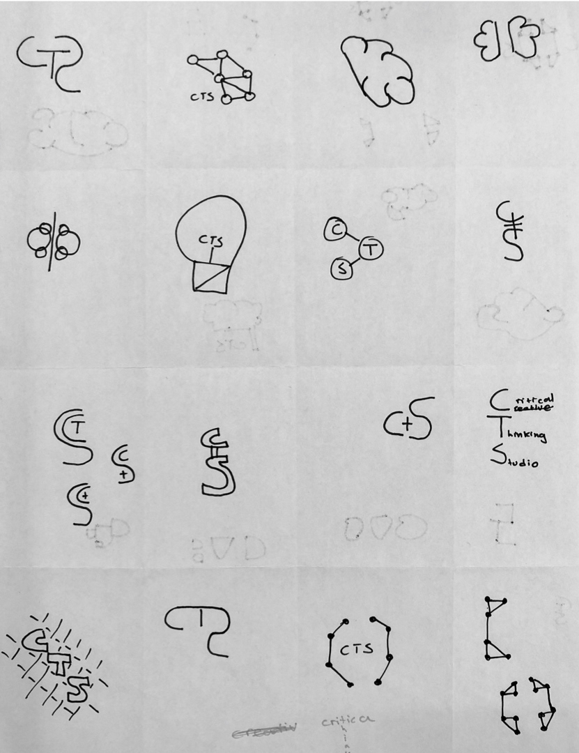
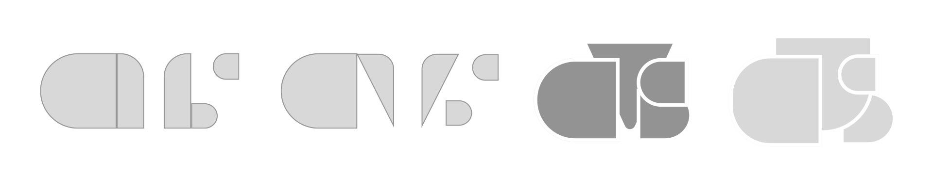
Next, I started playing with shapes to see if I could create the company’s name out of the layers of shapes and negative space. After multiple iterations, I was able to create the company’s acronym using the exact same shape but in different sizes and orientations.
Colour
Visually the logo contains three primary colours, but can also have the same effect in grey scale. It also retains its legibility at multiple different sizes.
I chose to use a split complementary colour harmony of green, yellow, and purple. This harmony is not a conventional colour harmony and one might initially think that the colours wouldn't look good together until you see them. I chose this because critical thinking is a more abstract form of thinking. I wanted colours that made you think and challenged what someone may think is right.

Individually the colours are important as well.
Purple combines the calm stability of blue and the fierce energy of red. The colour purple is often associated with royalty, ambition, creativity and wisdom.
Green helps alleviate anxiety, depression, and nervousness it is the most relaxing colour for the human eye to view because green takes up more space in the spectrum visible to the human eye. It is often associated with renewal and growth.
Yellow helps activate the memory, encourage communication, enhance vision, build confidence, and stimulate the nervous system.

At first glance, the shape looks to just be a symbol of the company, but with more insight, you can see the C T S take form. This relates back to the purpose of the app, using critical thinking to see the logo for more than what it is.