Company | Critical Thinking Studio
Timeframe | three weeks
Deliverable | native ios critical thinking application
_
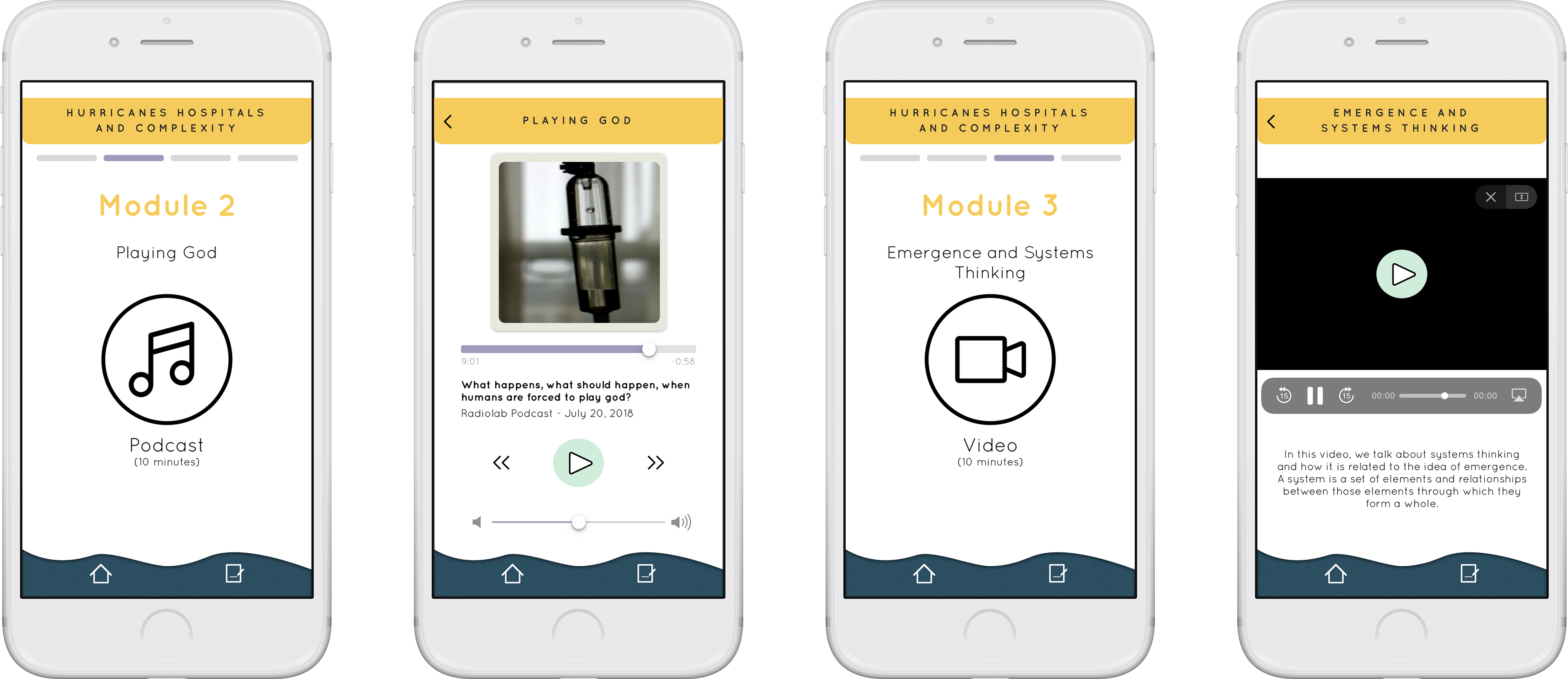
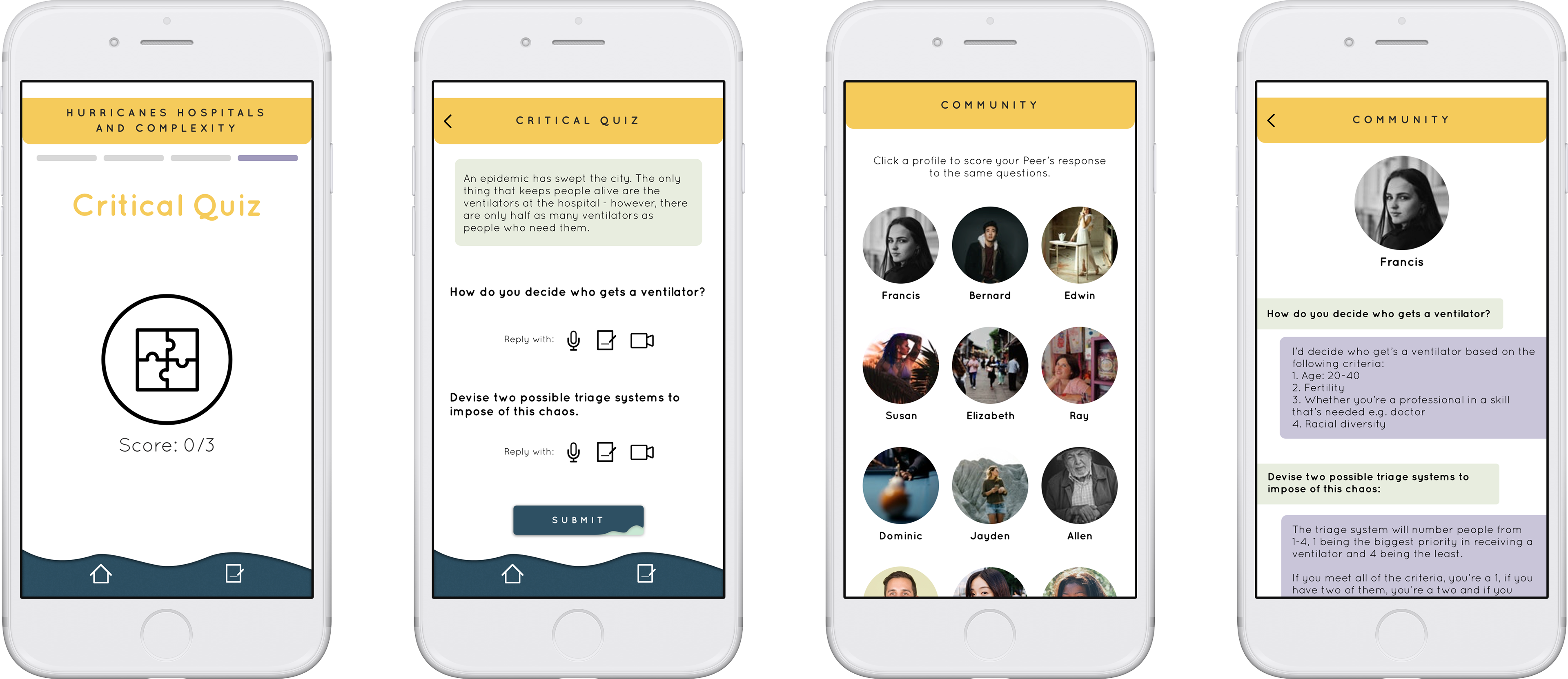
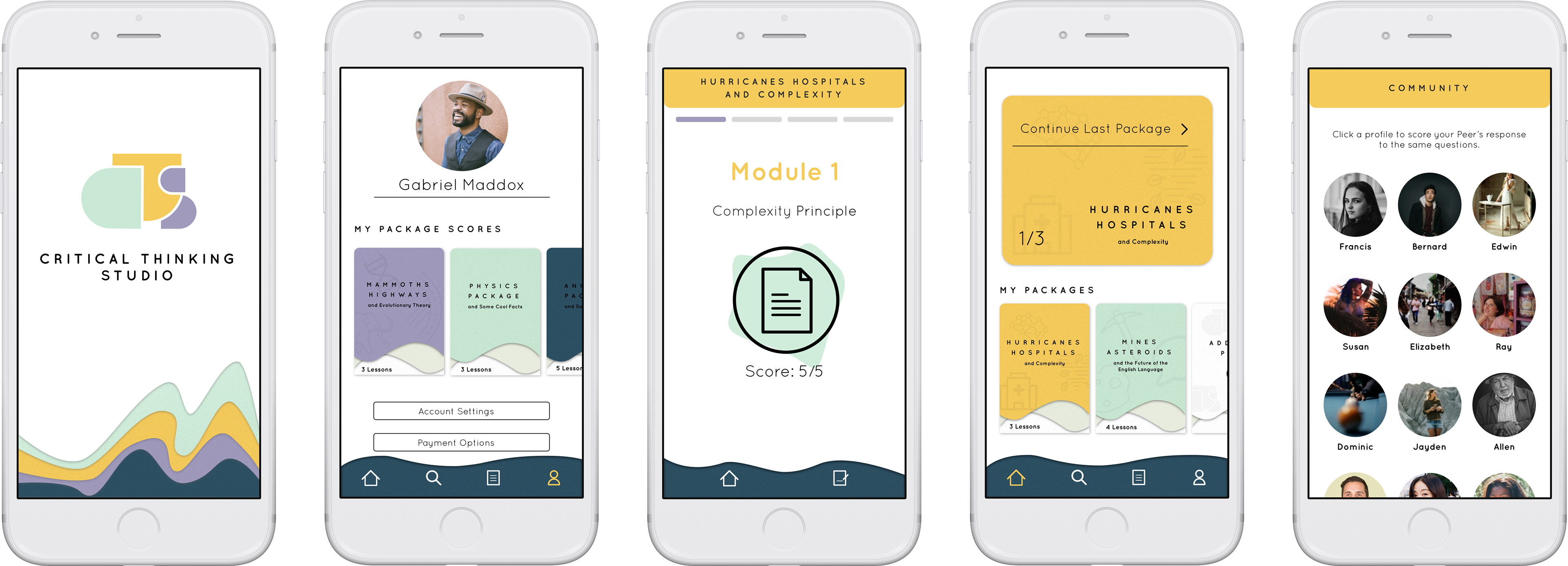
The goal of this project was to design an app that increases public access to interactive tools and resources that foster the use of critical thinking.
Client Goals
1. Take content that is currently exclusive and to make it more available.
2. In the long term, to introduce critical thinking as its own distinct branch under the broad category of self-improvement.
3. To make an app that facilitates the habit of thinking critically.
User Goals
1. To fill their desire to improve critical thinking.
2. To expose them to current and up to date events in a unique way.
3. To widen their perspective about the world and themselves.
4. To challenge their way of thinking.

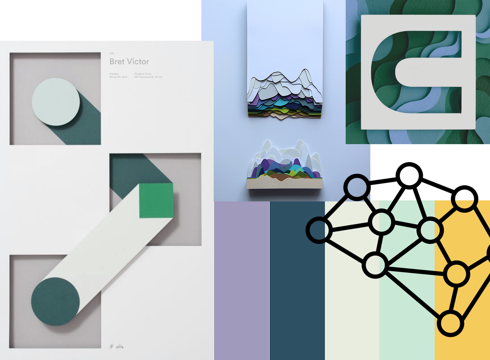
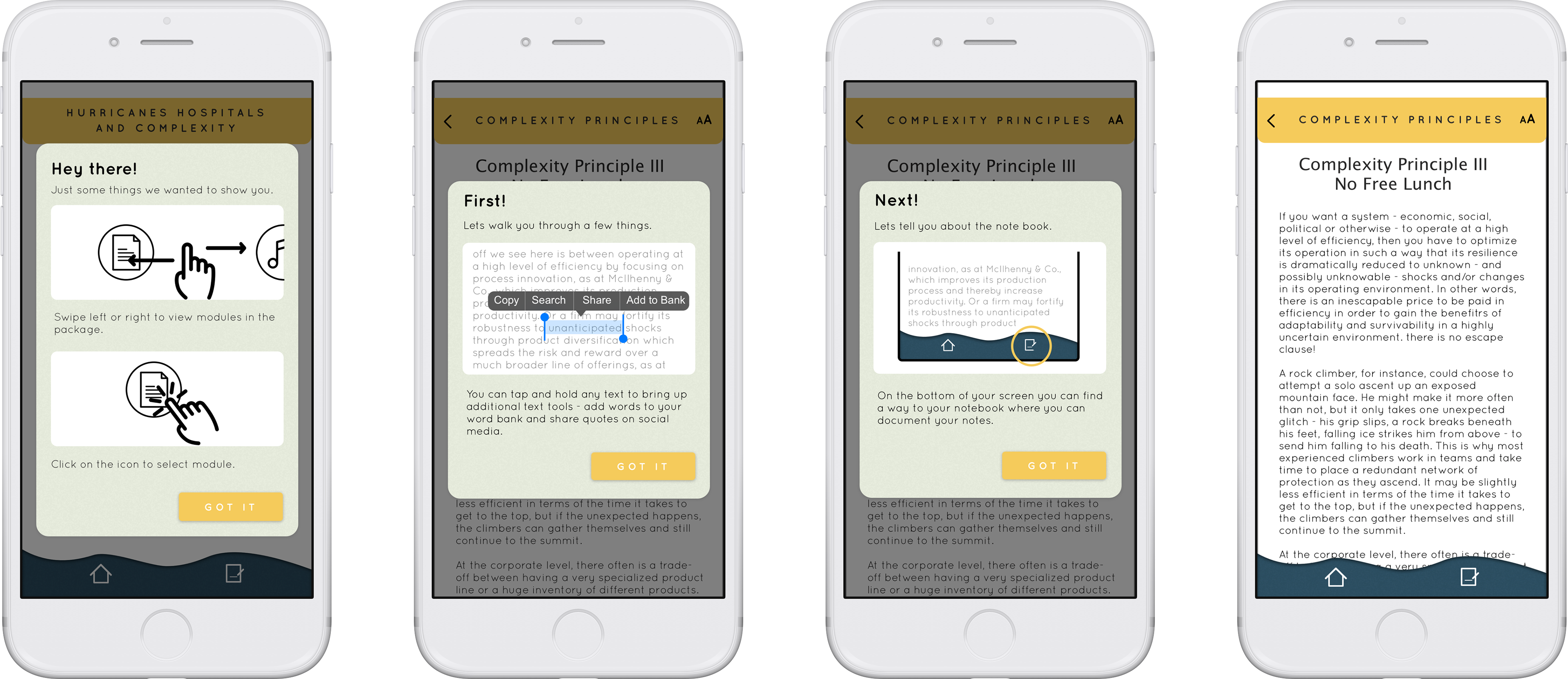
When thinking about the mood of the app the main imagery that came to my head was layers of paper. Creating a sense of depth with pages. I wanted to balance out the complexity of layered paper with simple iconography that kept the app feeling light.
I built my colour pallet off of my initial design inception. I chose a bright yellow to focus attention on CRT buttons. The purple and green are also primary colours but contrast the bright yellow and give a sense of calm as they are more pastel. The secondary colours are a muted light green and dark navy. These colours help to offset the primary colours.
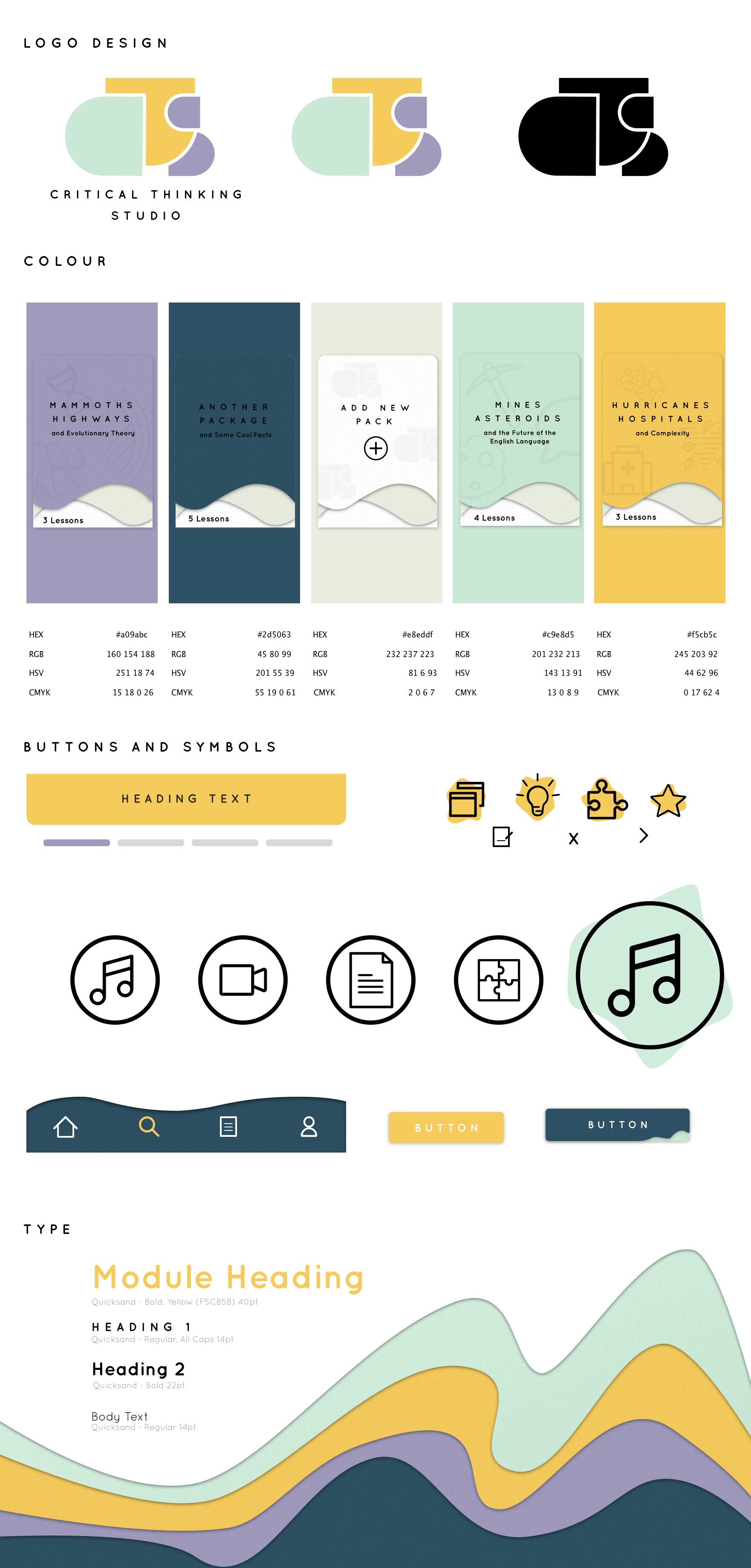

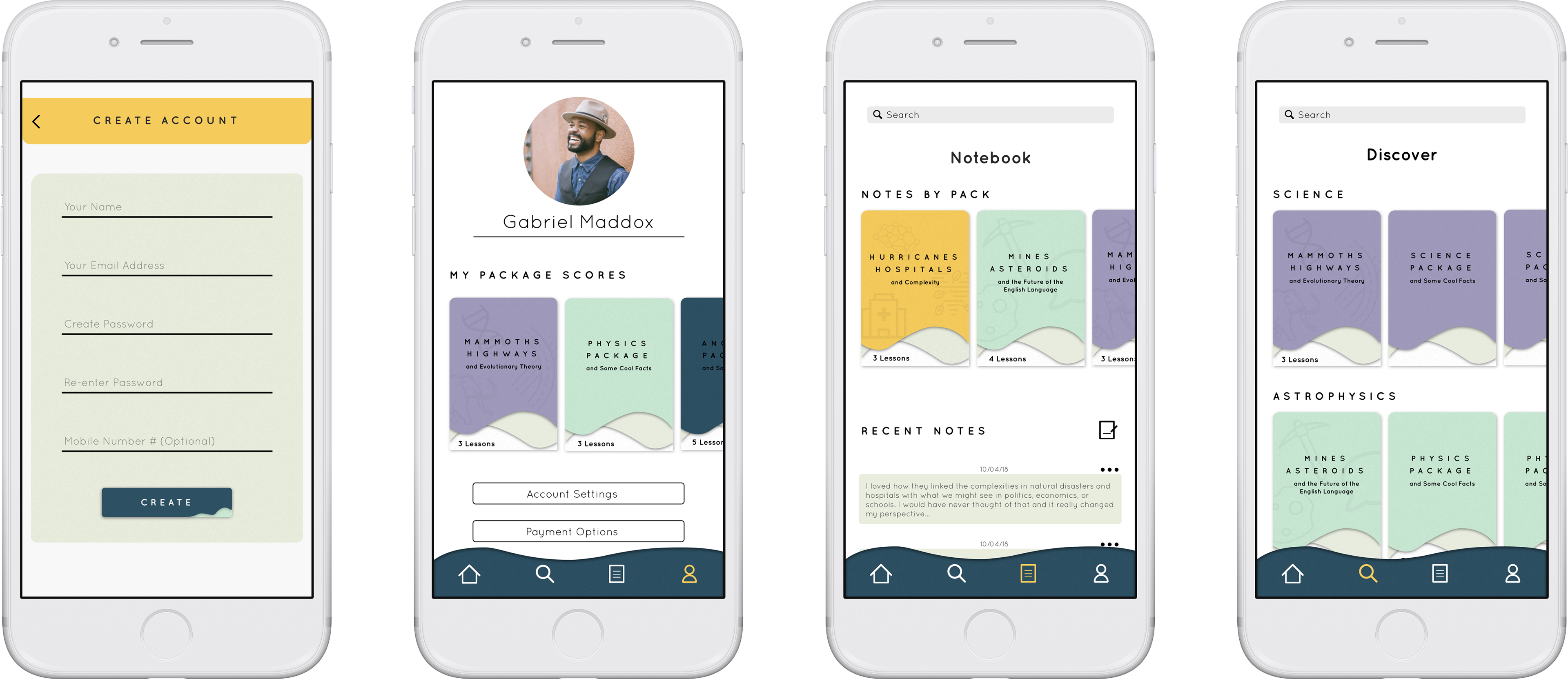
My first key feature of the design was the layered paper effect. I wanted to create a sense of depth for all three plains of my design, but without making it seem cheap. The suttle drop shadows over the stacked paper is unique in its design. The curvature of the paper adds a sense of creativity along with the added texture to each sheet. The design takes cues from Google’s material design but creates something that is its own.
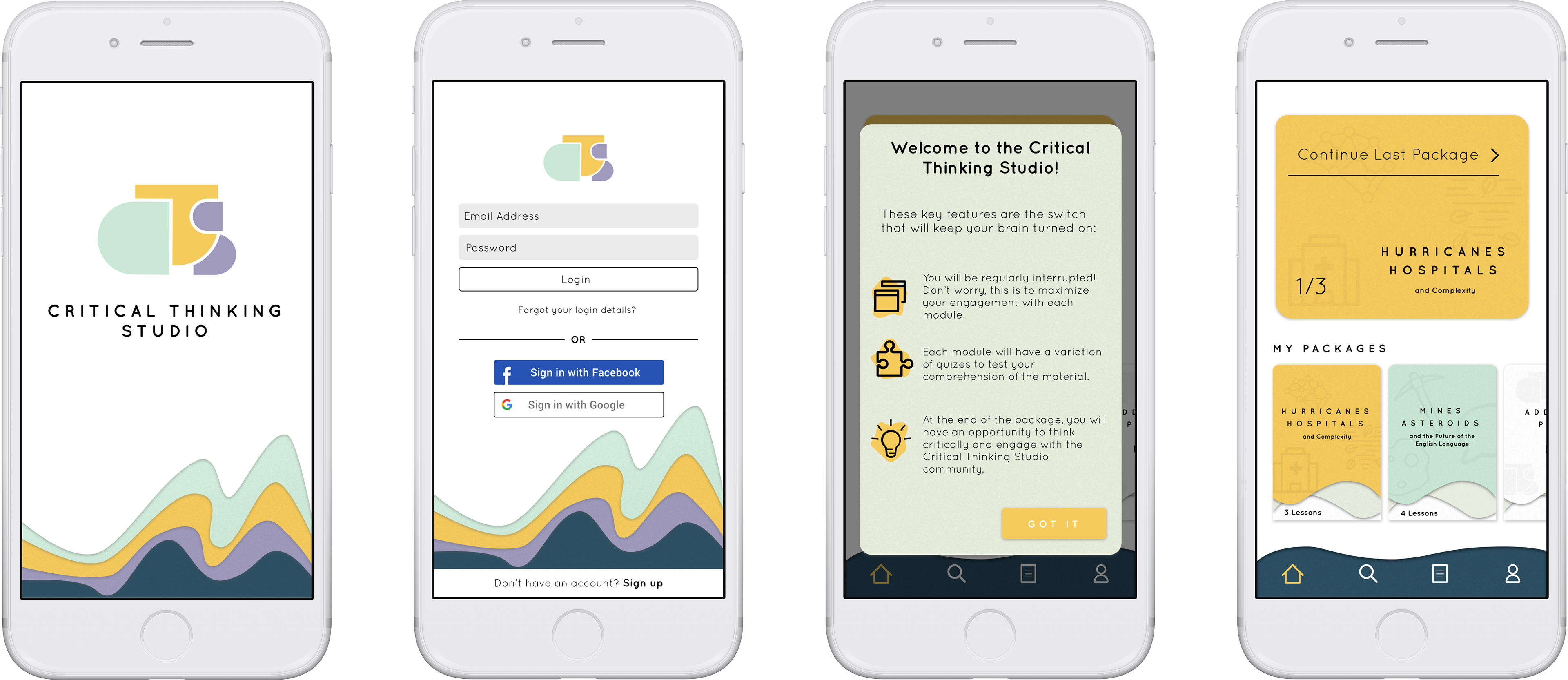
The next key feature is the UI process of moving through a package. I wanted it to feel like you selected a package from the home screen by picking it up and sliding the sheets up paper to the package content.

Overall the app feels purposeful in its design. It executes the design inception that I intended it to. The paper design is present but isn’t overpowering and allows the app to still feel current. The primary colour scheme paired with white space executes what I intended allowing the app to feel unintimidating, and approachable.